Minnesota Baseball Association
Website Redesign
My Role
UX Researcher
Stakeholder Interview
Heuristic Analysis
Usability Testing
Triading
Card Sorting
Architecture Diagramming
Modified A/B Testing
UX Designer
Sketching
Digital Wireframes
Storyboard
Interactive Prototyping
Tools
Figma
Trello
Optimal Workshop
Keynote
Zoom
Slack
Client
The Minnesota Baseball Association (MBA) is the governing body of amateur baseball across the state of Minnesota. With just under 300 active teams and 6,000 active players, the MBA supports more players than the MLB and MiLB combined. Their mission is simple: grow baseball across the state of Minnesota, support the players, coaches, and teams they govern, and ultimately increase revenue each season. The existing website is designed for those that are obligated to use it, so my focus was to increase user engagement on the website and, in turn, help the MBA grow the game of baseball and increase revenue.

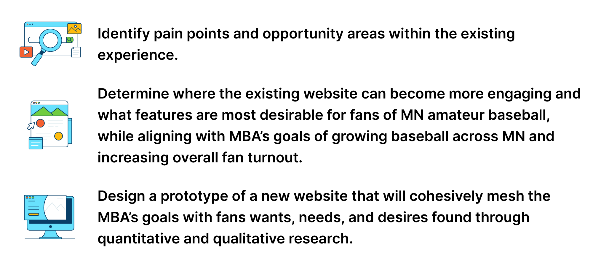
Goals
Who Is This Experience Designed For?
My focus:
The fans.
Why the secondary user group? Because the primary user group of players and coaches are obligated to use the website as there is no other option for them. Stakeholders communicated the desire to grow the game of baseball, which is done by increasing the audience and broadening the fan base, or secondary user group, of the Minnesota Baseball Association.
-
Obligated to use website for schedules, contracts, submission of scores, stats, and general team info
Aware of website architecture and flow due to high use
Biased due to obligations
-
Value:
Attending games
Viewing scores, schedules, stats, players, and teams
Reading up-to-date stories
Connecting with friends and family
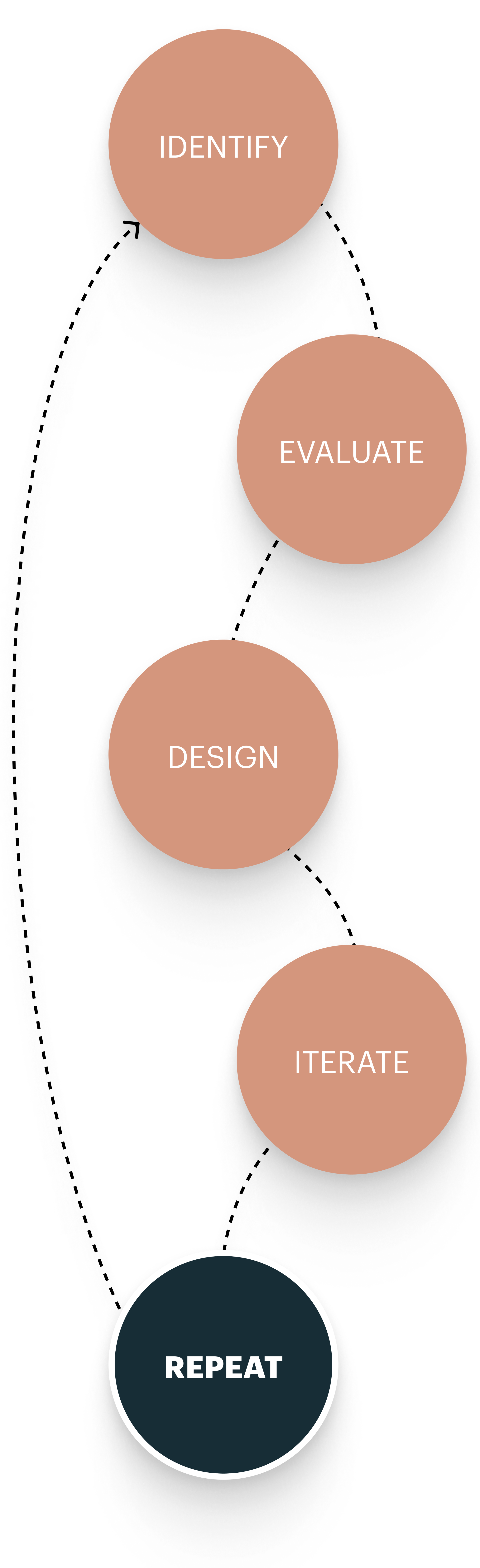
Identify pain points and opportunity areas, evaluate existing space, design an interactive prototype, iterate designs, and REPEAT.
Identify
The first phase required me to learn the goals, pain points, and opportunity areas of the existing design through interview and testing sessions.
-
Stakeholder Interview
Usability Testing
Triading
Evaluate
I determined and evaluated the current website, user flows, and overall usability using quantitative and qualitative research methods.
-
Heuristic Analysis
Architecture Diagramming
Card Sorting
Secondary Research
Design
Initial designs were created by hand and were further developed with a library in Figma.
-
Sketches
Low-Mid Fidelity Wireframes
Interactive Prototyping
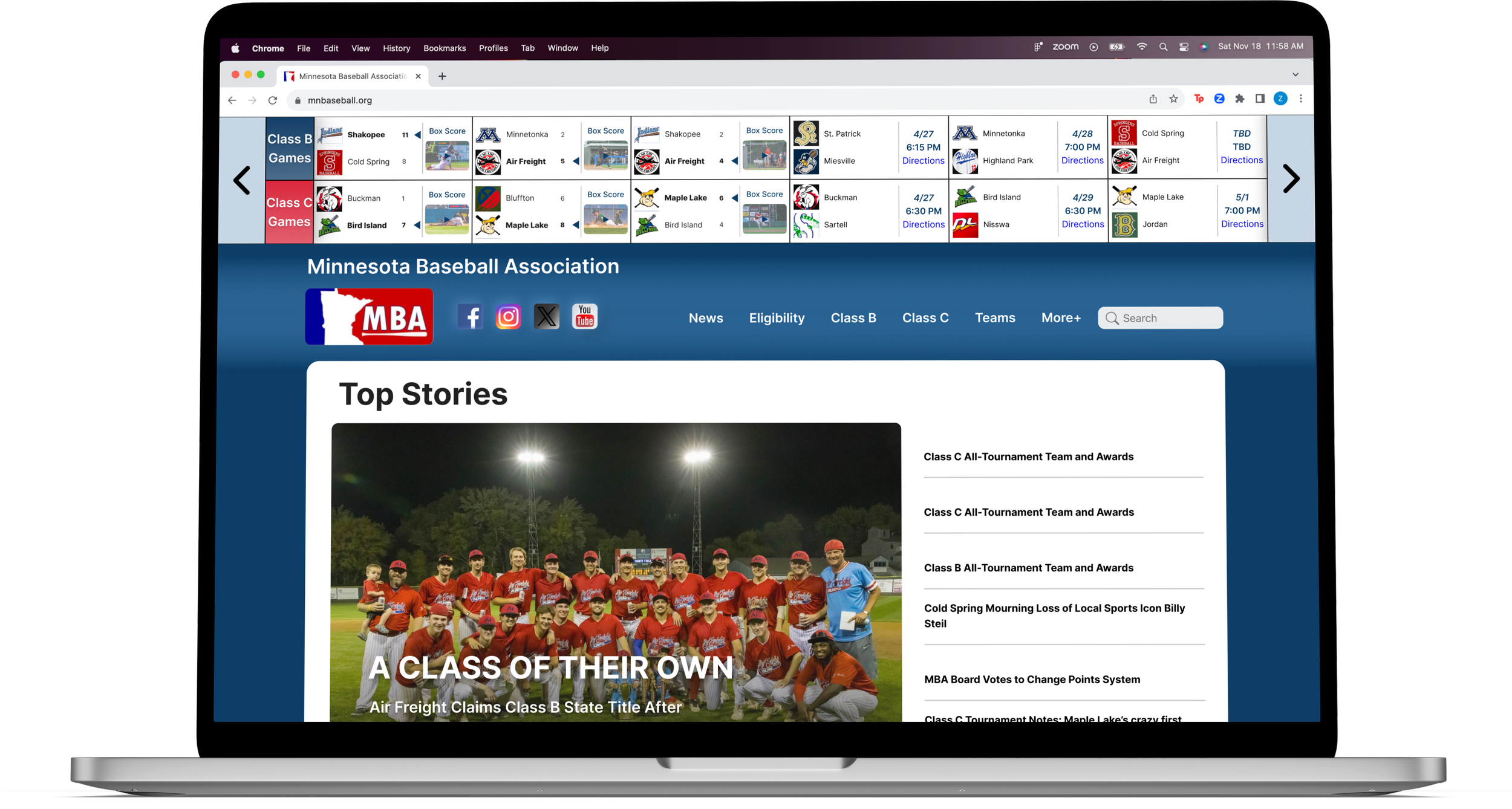
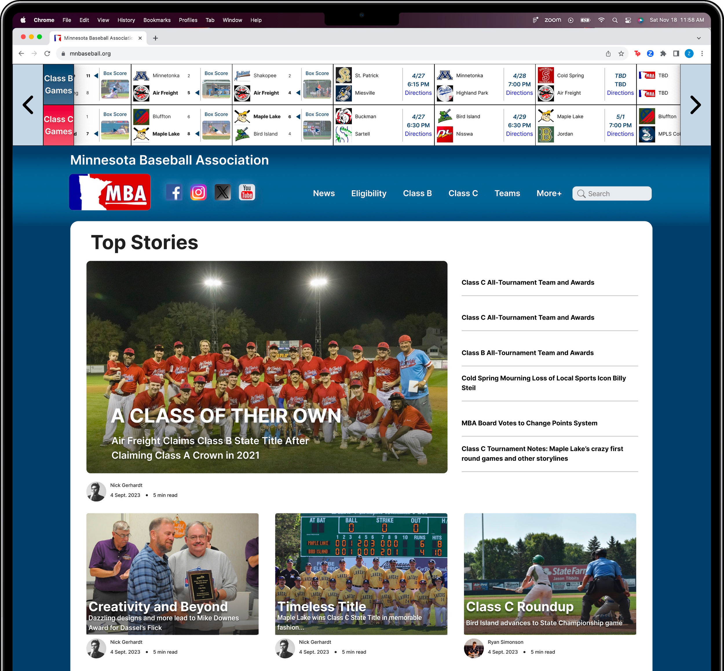
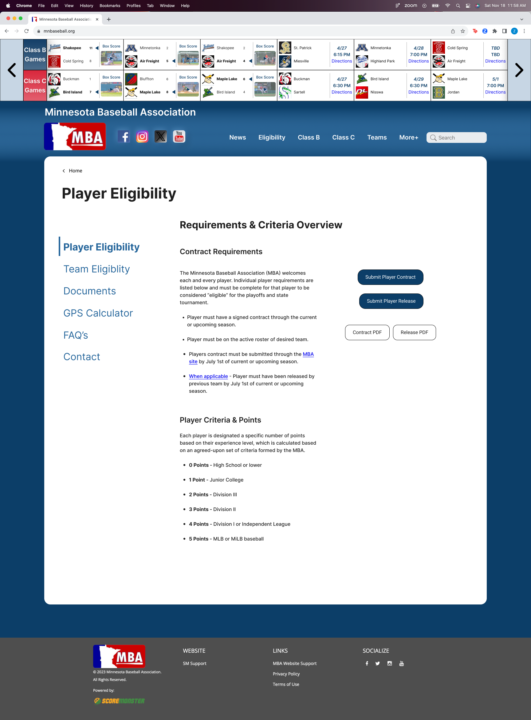
Current MBA Website Design
Iterate
An iterative approach was taken to get feedback from users on the initial design and make improvements.
-
A/B Testing
High Fidelity Wireframes
Interactive Prototyping
REPEAT!
Identifying the Problem Space
I needed to understand what the goals, desires, pain points, and opportunity areas were for both the MBA and for the fans to help me prioritize design features.
Initial Scope:
Redesign the desktop website to have more consistency, meet the mental model of users, and drive more engagement with the website.
-
Goal(s):
To gain insight into the MBA’s organizational goals, direction of the company, and future vision for the existing website.
-
Executed using Nielsen’s heuristics.
Goal(s):
Determine what standard design principles are being violated
Show what areas need immediate action
-
6 participants were observed completing set prompts and answering questions about their experience with existing website.
Goal(s)
Determine pain points, opportunity areas, and desirable features
Understand users goals
-
Participants given screenshots of the “same” page (e.g. a stats page) from three similar websites and were asked to differentiate on from the others and explain why.
Goal(s)
Understand what users expect to see and interact with
Find out what is being done well and not so well
Methods were chosen for their immersive nature.
Triading portion of usability testing.
Impact and Discoveries
I discovered the MBA’s goals and vision for the future, identified the pain points and opportunity areas within the existing experience, and identified users wants, needs, and goals.
-
Grow the sport of baseball across Minnesota
Support the players and coaches
Increase revenue
Increase fan attendance
-
0% Click through rate on carousel news articles
All users were overwhelmed and confused on homepage
No clear calls to action throughout site
-
Attend games
View desired scores, stats, standings, teams, and players
Connect with friends and family
Discoveries led to a realization.
I need to refocus my scope and pivot.
The Pivot.
Focus on designing a new homepage, specifically, to increase user engagement and interaction as it is the foundation of the website and sculpts users first impressions.
Letting Others Guide The Process
Card sorting, system architecture, and secondary research provided post-pivot clarity on feature prioritization for the design of the homepage.
Card Sorting
A card sorting activity was created on Optimal Workshop to see how users would ideally organize information in the navigation bar and throughout the website. 20 responses helped prioritize the main categories on the redesigned navigation bar. While it was a success, I would condense the amount of “cards” to be sorted to yield more results as well as give the users already made category titles to sort in.
Architecture Diagram
Once my pivot was determined, I zeroed in on the homepage and let the existing layout and architecture show me where more specific opportunity areas may lie. Allowing the existing experience to show me where these changes would be most effective, continued to determine the priority level of features.
…More Research!
Secondary research and was done to determine what prioritized features have been proven to engage users the most, while also aligning with UX best practices.
Feature Imagination and Prioritization
Hand Sketches to Wireframes
How can I efficiently measure the impact of my design?
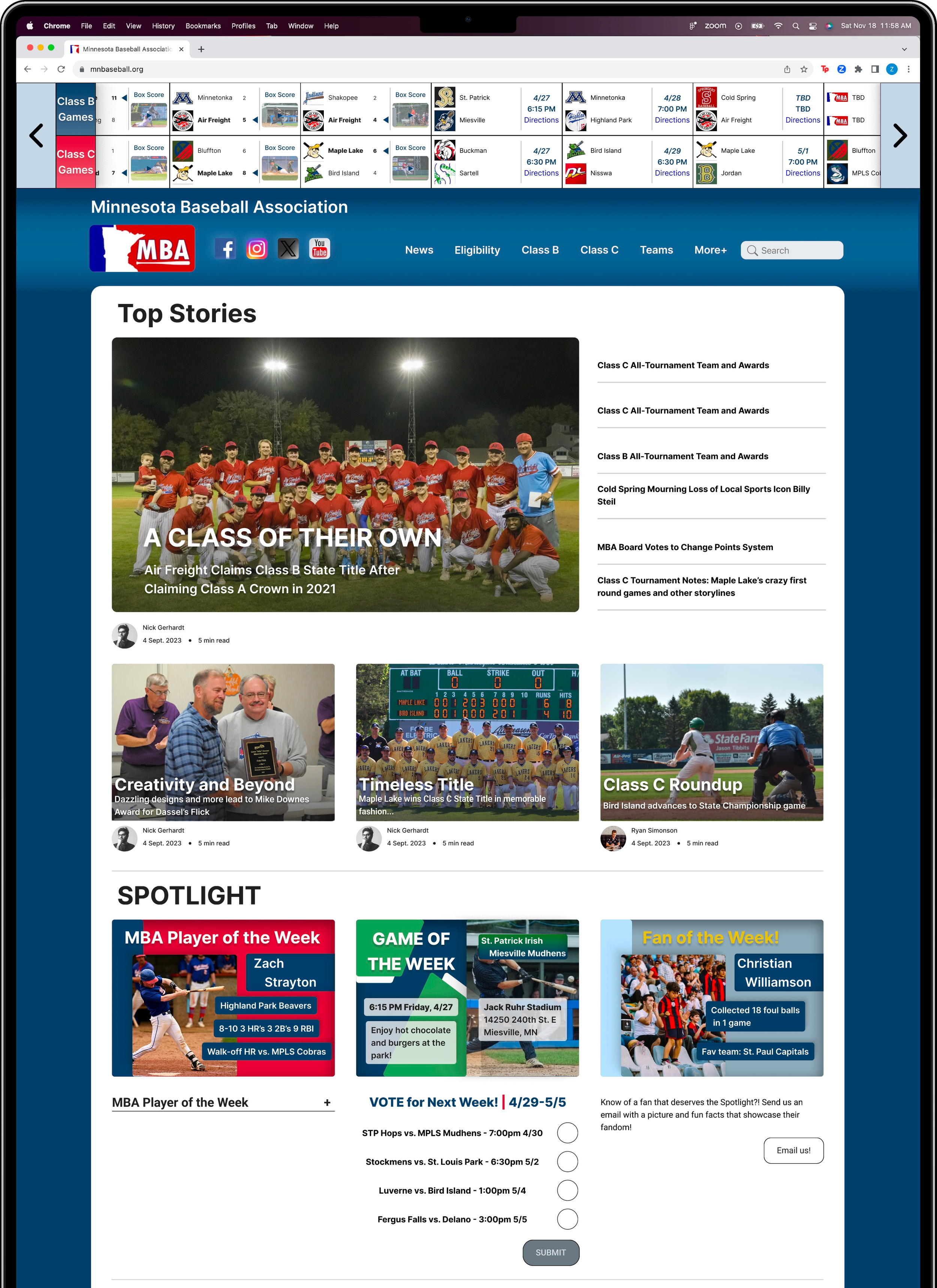
First, I needed to produce a mid fidelity interactive prototype to compete with the existing website. Since I did not have two live websites, I had users freely navigate the existing website and then the prototype, separately, during a facilitated session. I observed users emotions, interactions, and calculated click through rates to determine if my synthesized research and initial designs were increasing engagement and performance.

Modified A/B Testing!
Newly designed article section increased Click Through Rate by:
200%
“I would actually want to interact with this version of the homepage.”
- A/B Test Participant
Bringing the Design to Life
Ticker Scoreboard & Navbar Organization
-
The image carousel was redesigned with a new article layout based on research by Notre Dame that showed only 1% of users click on image carousels
Click through rate was increased by 200%
Source: https://thegood.com/insights/ecommerce-image-carousels/
Short Form Video & Rankings Graphic
-
All usability test participants communicated the desire to see highlights or videos
Short-form videos are a monetary opportunity for the MBA to capitalize on through YouTube and their partner NGIN
Article Layout, Effective Thumbnails, & Calls to Action
-
New ticker scrolling scoreboard design increased engagement and click through rate by 175%
Newly designed navbar categories were determined by survey participants and showcase better clarity, organization and visibility as stated by 2 users during A/B testing
Fan Engagement Section
-
All participants in A/B testing engaged with the Spotlight Section and elicited feelings of inclusion and curiosity
Quick, engaging, and interesting CTA’s show the MBA cares about the experience their fans have
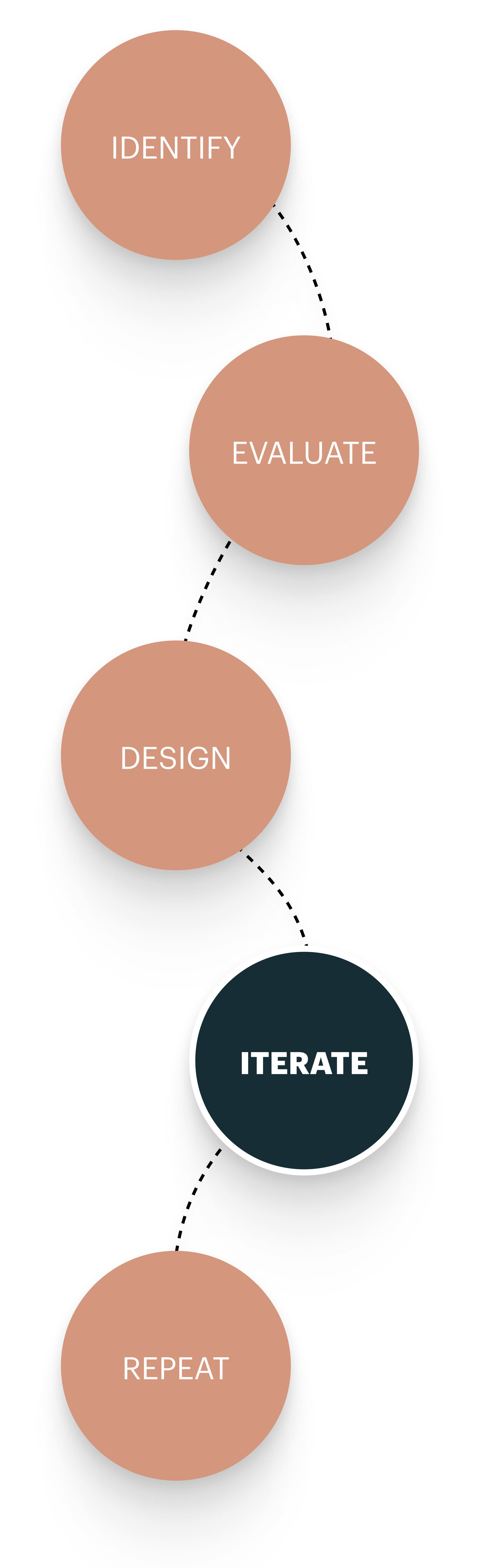
Time to Repeat the Process!
Identify, design, and test the happy path users desire to view team information, statistics, and State Tournament information would be the next step of this process. This will be achieved through a deep dive into system architecture and rapid iterative prototyping and testing.