MN Department of Human Services
SaaS System Redesign
“If I had asked people what they wanted, they would have said faster horses.” - Henry Ford
My Role
UX Researcher
Secondary Research
Cognitive Walkthrough
Contextual Inquiry
Information Architecture
UX/UI Designer
Sketches
Digital Wireframes
Interactive Prototyping
Tools
Figma
Figjam
Google Docs
Google Sheets
Slack
Zoom
Client
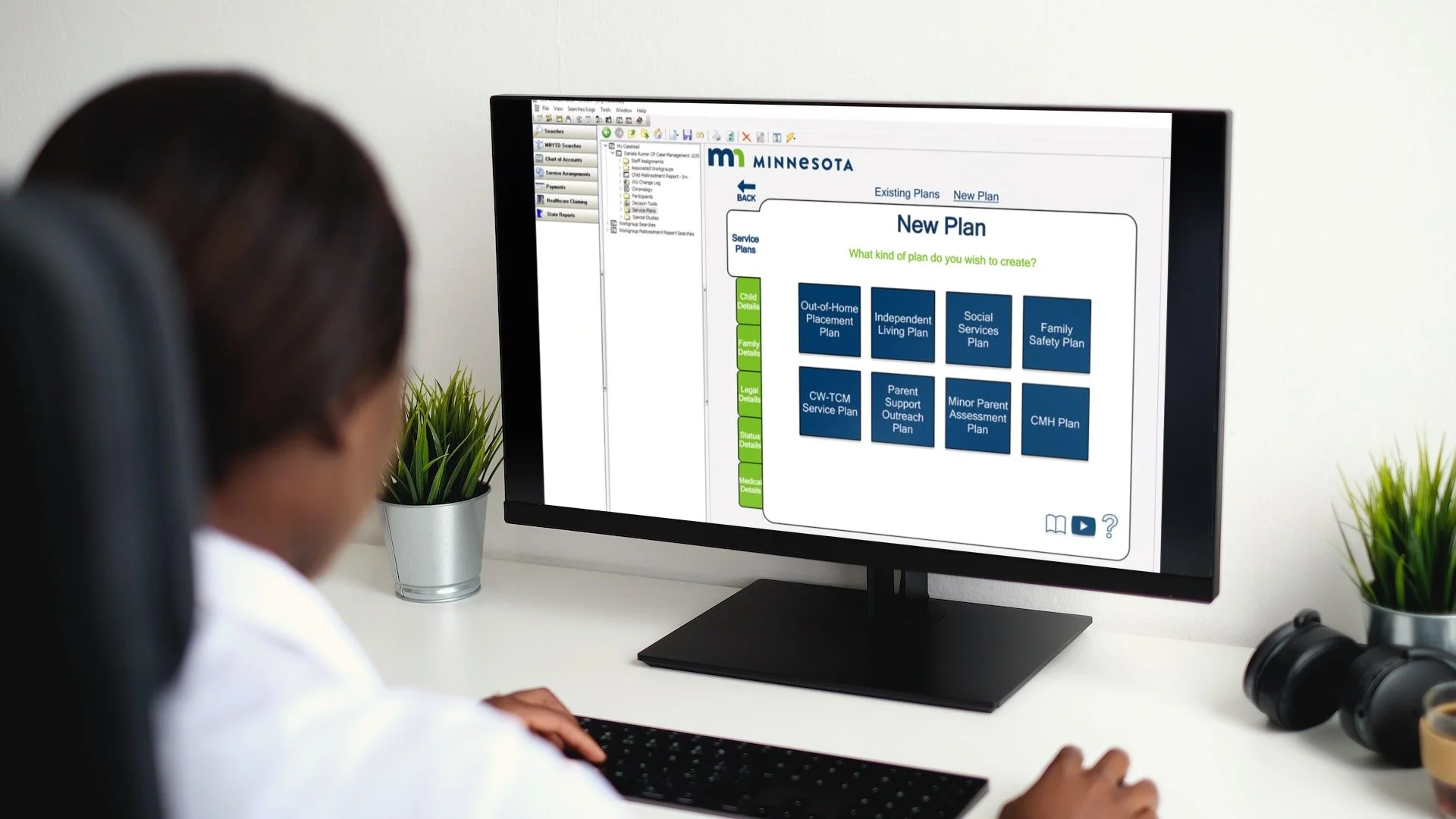
The Minnesota Department of Human Services (MNDHS) is a state funded organization who’s mission is to protect, maintain, and improve the health of all Minnesotans. When it comes to child welfare, one important aspect of some service plans is an Out-of-Home Placement Plan (OHPP) document. An OHPP addresses federal and state case plan requirements that support a child’s safety, permanency and well-being. The setup and documentation of an OHPP within the Social Services Information System (SSIS) was the core focus of the project. Within that scope, my team was enlisted to research and recommend design system changes for the setup phase of an OHPP. I served as the lead moderator for our contextual inquiry session and made individual recommendations based on collaborative synthesis.

Goals

Who does this system impact?
Minnesotan case workers and case aids that connect children in need of living assistance due to a number of circumstances are the primary user group. Case workers are passionate about what they do and aim to successfully and effectively find safe and sustainable living situations for all children in their caseload. An OHPP must be created within 30 days of a child being placed in foster care.
-
Case Workers from all over the state of Minnesota
Case Aids that help in processing of OHPP documents
-
Child Protective Services
Children in need of a temporary living plan
Families in need of supportive child care systems
Foster Families
Where to start?
Determining case workers pain points and goals allowed me to focus on the features that would make the most positive impact.
Contextual Inquiry
I was the sole, lead moderator for my UX team of 8, and crafted a script to focus on intricacies, pain points, and standards of the system. The user, a caseworker, guided the walkthrough based off scenarios, questions, and statements I communicated, while I warmly asked the user why they performed specific actions, what changes they would like to see, what affordances certain functions or tasks had, and what work arounds they use. Continually asking the user why gave my team and I insight into what the users pain points are, the opportunity areas, and the users primary goals.


Caseworkers ultimate goal is to be in the field spending more time with families to help them live in dignity and achieve their highest potential.
What did I find?
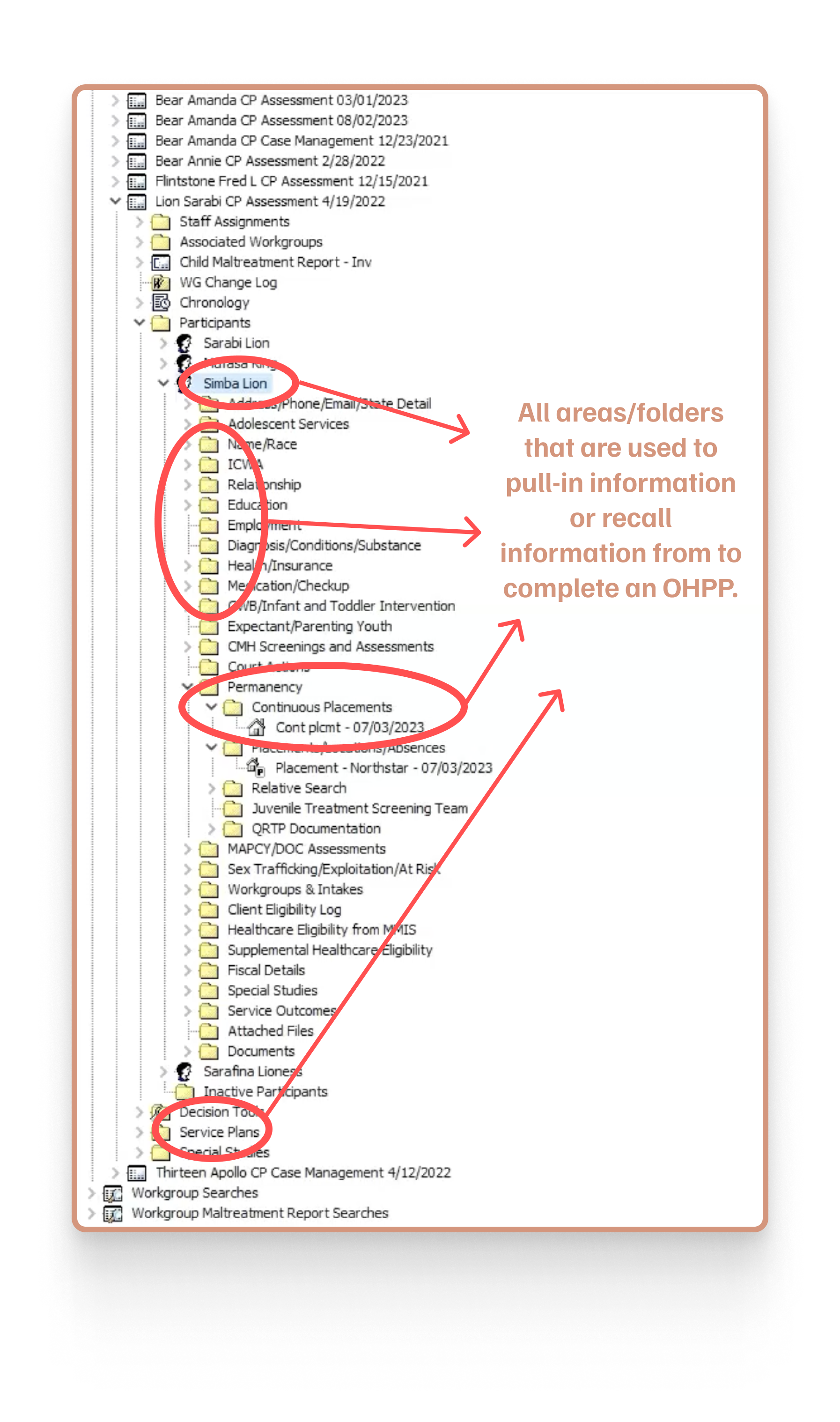
An entangled web of folders with little to no clarity of navigation, visibility, or functionality, is not consistent with modern design systems and was proven to be extremely inefficient.
What was communicated
Visibility of confirmation and verification that correct information was typed would reduce errors.
Caseworkers were confused about whether information was regulated or subjective.
1 worker stated it took them 2 years to fully comprehend the SSIS system.
Unfamiliar or new users receive little to no training on the SSIS system which leads to frustration and an extreme loss of efficiency.
What was observed
Creating an Out-of-Home Placement Plan (OHPP) is a time sucking, energy taking, and frustrating process for case workers.
Organizational issues such as folder inconsistencies, page clarity, and hierarchy of fonts, colors, and icons.
Inconsistent and non-responsive feedback allowed for mistakes to go undetected.
We observed that users needed to recall information from previous pages on a consistent basis which led to frustration and inefficiency.
Synthesizing research led me to focus on…

Streamlining and simplifying organization to increase productivity and reduce recall and frustration.
Incorporating reliable feedback to increase confidence and reduce confusion.
Create an intuitive navigation to increase efficiency and decrease stress.
After synthesis of all research led to a few main themes, I quickly sketched out a screen flow of what my vision was. This afforded me the ability to highlight where the changes I wanted to make fit into the system and what screens may be most important in a short period of time. Then I created low-fidelity, hand sketched wireframes of what was originally thought to be three main flow screens to align with the main themes that were synthesized.
Low-Fidelity Vision
Simple wireframes and a screen flow allowed me to quickly scope out the rest of my process and made the location of impact clear.
Hand sketches of three different flow screens.
Screen flow created to establish where changes will be made. “ICWA” changed to “Eligibility”
The Impact
An interactive prototype that guides caseworkers to their ultimate goal of being in the field effectively and efficiently.
Efficiency
Autofill Functionality
-
Re-designed document fill pages for better aesthetic and modern consistency.
Auto-fill button to pull information from existing files.
Usable in each section of the setup phase.
-
Increases user efficiency by pulling information already used within the system.
Caseworkers communicated desire to switch between participants (drop down shown, but not prototyped).
User can edit each page if necessary (not prototyped, but edit button shown) - this was communicated as an issue during contextual inquiry.
Streamlined Documentation
-
Easy to follow prompts to decrease confusion.
“I don’t know” card shows definitions, tutorial, and applicability.
Icons in bottom left of each page will show this information as well.
Check boxes used to show completion of an action.
Radio buttons used for Yes/No questions.
Progress bars giving users feedback.
-
ICWA documentation is inconsistent among caseworkers due to visibility, navigation, and recall
Yes, I don’t know, and No cards created for error prevention.
Yes/No radio buttons that release a drop down for certain answers results in less confusion and frustration for users.
Feedback
Error Prevention & Confirmations
-
Modal pop-up for error prevention.
Highlighted box with color, text, and icon to let user know where the change is needed.
Saving and saved actions with color, text, and icon to communicate to user what is happening.
Section color changes at top and slide bar moves to next page.
GIF above shows a progress bar as another representation of feedback.
-
Users stated required information that was not input was not clearly communicated.
My team observed no saving confirmation during any process.
All fonts and colors are the same - green, red, and navy can differentiate that as well as different icons.
Organization
Folders, Navigation,
& Branding
-
Structured tabs for concise organization.
Streamlined consistency with tabs on different pages increases efficiency and decreases confusion.
Visibility and hierarchy of fonts, icons, and text clearly indicate where user is and what they can do next.
Using MNDHS style guide to integrate warm and modern feel.
-
Navigation between folders was frustrating and time-consuming for users.
Font size and color was the same for all folders, text on documents, etc. which caused user to become annoyed and frustrated when navigating and completing documentation.
To view the interactive prototype, you may click this button —>
Reflection
Understanding a users ultimate goal guiding them on an effective journey to achieve it is continuing to embody my work. For caseworkers in the state of Minnesota, that means to spend more time in the field with families and children they have an unconditional connection with. Designing a system that provides more efficient productivity accompanied with less strain and energy output allows these caseworkers to succeed and thrive in the expert areas they were hired for in the first place. Continuing research of the SSIS software would be necessary to provide more insight into pain points of the existing system, elicit opportunity areas for change and growth, and create an even deeper connection and empathic understanding of the users.